← All case studiesArchv / Selected work
Branding · Packaging
Common Table
A restaurant identity that turns a familiar meal into a shared experience.
01 / The project
The project
Common Table is a contemporary fried chicken restaurant that brings comfort food into a considered, accessible dining setting. Its brand concept treats “common” as something shared: a table where people gather, talk, and eat together.
02 / Design decisions
The approach
01
Wordmark and monogram
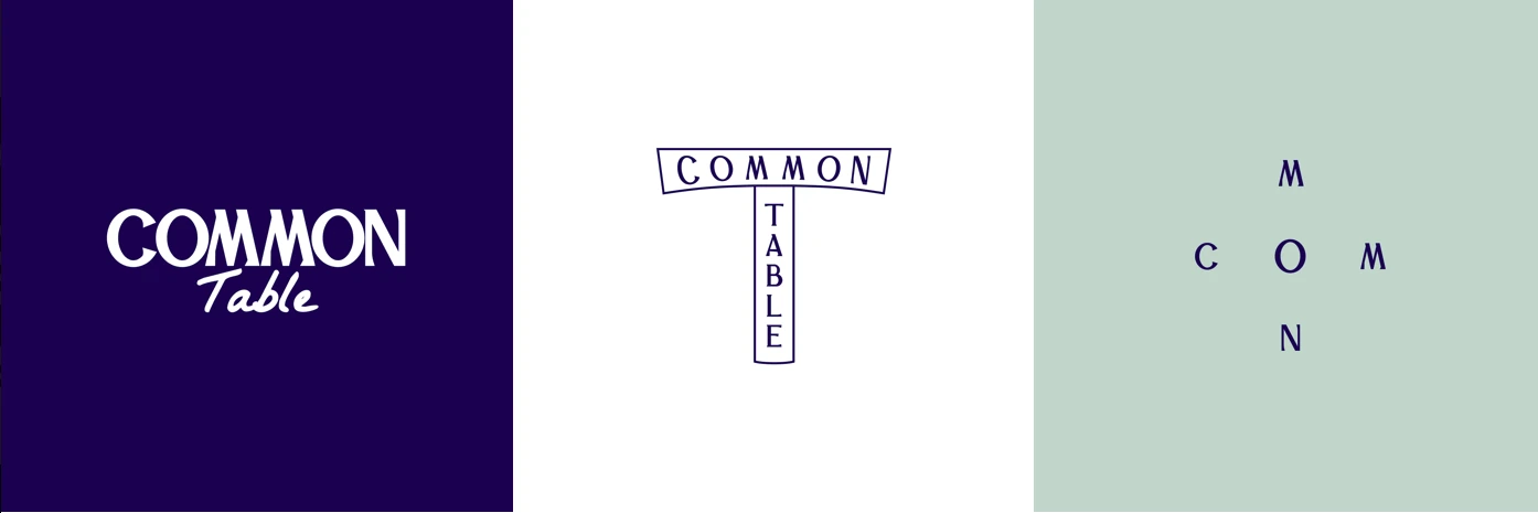
The visual system shows an expressive Common Table wordmark and a compact T-shaped mark that brings the two words together.
02
A recognizable visual language
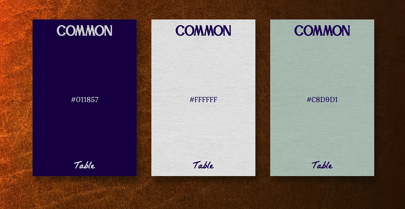
Deep navy, white, and pale mint are paired with hand-drawn food icons to keep the system clear and approachable.
03
From sign to service
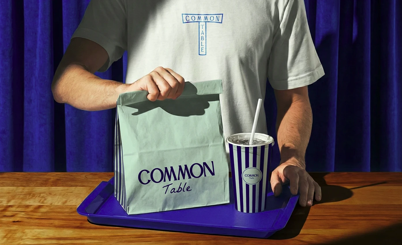
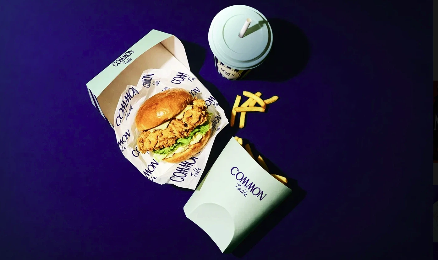
The marks, colors, and illustrations extend across wrappers, cartons, cups, bags, and apparel.
03 / Scope
What we made
- Brand identity
- Logo system
- Food illustration
- Packaging
- Art direction